
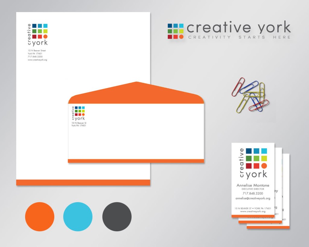

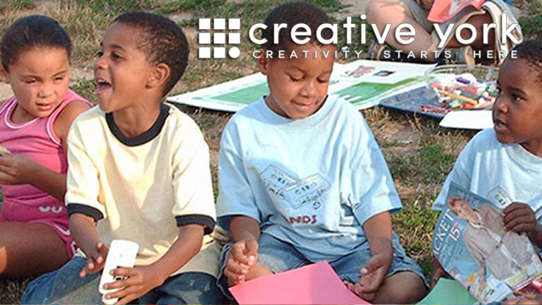

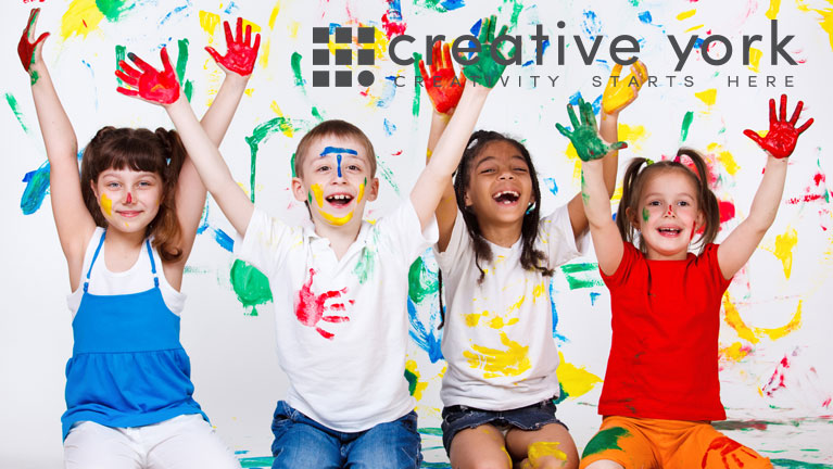

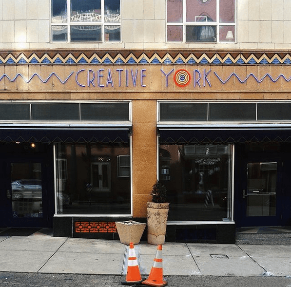
This was a rebranding campaign for the non-profit formerly known as YorkArts. I worked with YorkArts in various capacities since the mid-90s and was honored to be a part of their capital campaign and transformation to “Creative York”.
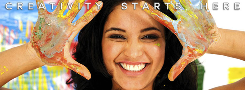
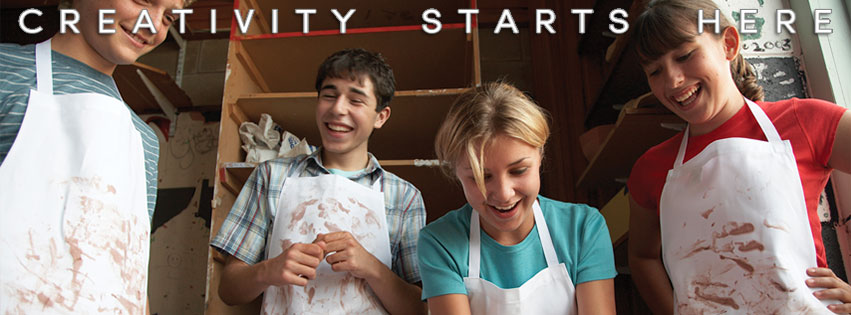
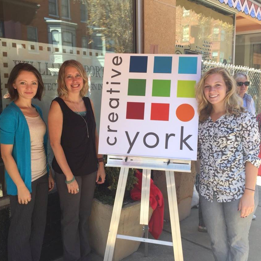
The organization wanted their metamorphosis to reflect an identity that was crisp and modern with clean, bright colors in an array of hues similar to an artist’s palette. They also requested a website and other digital assets that they could maintain in-house.
We started out developing the logo, then applied that to their team’s business cards and updated the organization’s letterhead and envelope. From there, we expanded the new look into an 8-page catalog to promote their classes and a pared down bi-fold brochure version of the catalog that they could use to save cost.
Then we dove into the digital assets. I started out developing a WordPress website that I trained the team how to use and maintain. I then created several different Constant Contact e-newsletter templates for events, classes, gallery shows, etc. Next, I moved on to creating cover photos and other images for the organization’s various social media outlets.
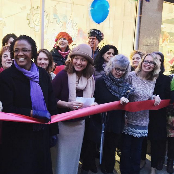
After all of that, it was time to start working on the announcements about the grand re-opening! So more print and digital ads were created.
Once all of these elements were in place, I put together a photo archive of key images the team could pull from to maintain the brand look and feel, along with a brand manual which outlined logo usage, fonts, colors, etc.
Let’s Work Together!
For over 20 years, I’ve been helping clients bring their unique visions to life so they can achieve their branding and marketing goals. Interested in collaborating? REACH OUT or text NEED DESIGN to +1 717-858-0344.
